Summer color trends 2024 and how to match them with your brand campaigns
New season, new color trends. Grab your audience's attention and level up your storytelling with trending hues and tones.
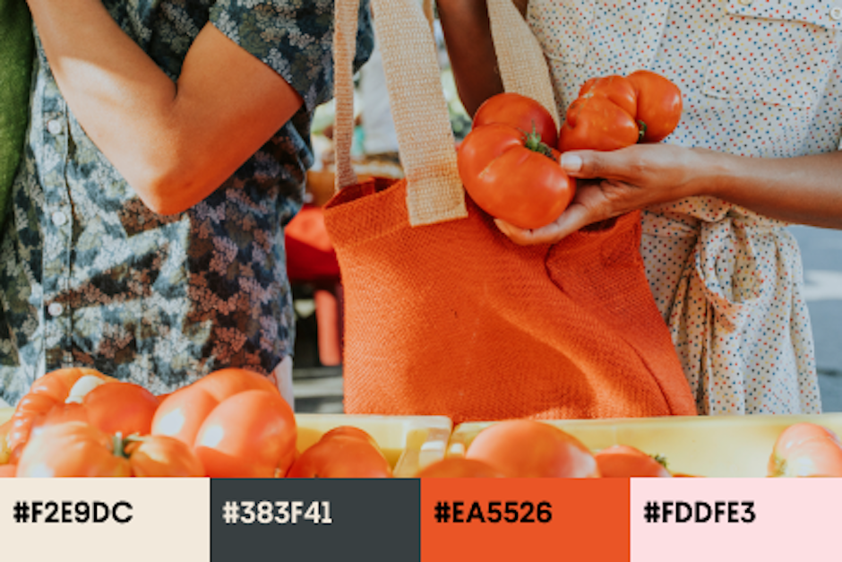
Summer is not a high-activity season for most brands, especially those focused on serving other businesses. For the same reason, this period works well for experimenting with tone of voice and design, including adding trending colors to average layouts.
After researching Creative Trends 2024 and Design Trends 2024, the Depositphotos team is glad to present the results of their niche investigation into this summer’s most striking colors.
To create a list of just four shades, the stock content platform’s experts analyzed content demands, campaigns by market leaders, and the accounts of creative influencers. Ready to add vibrant hues to your messages and attract more customers? Scroll down for ideas and examples.
What you need to know about color trends of summer 2024
With old money and cottagecore continuing to dominate this year, the most promising colors for marketing campaigns and creative projects appear minimalistic and aesthetic. Sand Castle, Summer Rain, Fire Flame, and Pearlescence are four hues that will make your design materials more appealing to audiences and look up-to-date.
What’s unique about these colors? First, each one has great storytelling potential and will serve as an excellent background for text-only layouts. They’ll make your designs look mystical and add depth to your messages. Second, they look rich and soothing simultaneously, which motivates users to spend more time observing your materials without being overwhelmed with visual information.
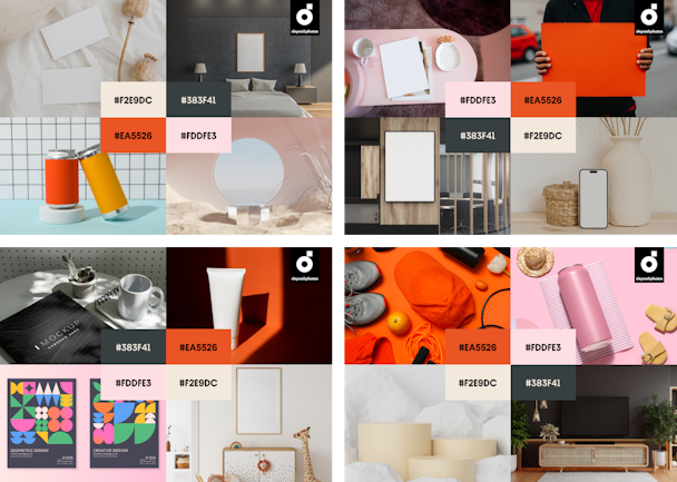
Third, all trending colors are flexible when combined with your brand colors. Whether on product packaging, a YouTube ad, or your new booklet, warm dyes like Pearlescence or Summer Rain will add balance or intriguing detail to the composition.
And if you have concerns about getting too experimental with your marketing designs, here are a few tips to stay safe while dealing with uprising trends—Leveraging 2024 trends: How to minimize risks when experimenting with booming aesthetics.
4 color trends to try this summer: Ideas & examples
1. Sand Castle (#F2E9DC)
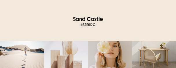
Great for: website page backgrounds and campaign images.
Best color match: blue, purple, green, pink, and brown.
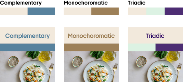
If your idea is to add a timeless element to your designs, this hue is the number one candidate for you to try. Another advantage is that it doesn’t evoke direct associations with summer, so you can continue using it in autumn or winter campaigns, making your communication even more consistent.
Sand Castle is also known as greige since it resembles a combination of gray and beige, with both colors symbolizing nobility and purity. Greige is also the most significant hue in the classic Cottagecore palette and, if combined with deep green shades, makes products and layouts more natural and appealing.
Try some ready-to-use stock visuals to see how Sand Castle can contribute to your campaign messages.
2. Summer Rain (#383F41)
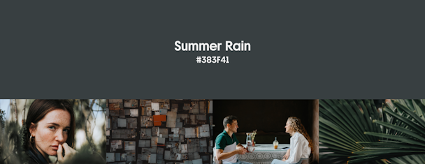
Great for: headlines and dominant color in campaign images; backgrounds of small-size designs like banners and gift cards.
Best color match: orange, yellow, and muted blue.
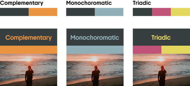
Summer is when nature craves rain; for people, summer rain — no matter how heavy it is — symbolizes long-awaited refreshment and joy. In turn, the Summer Rain hue, despite being almost noir, carries a positive vibe and looks appealing to audiences. The color can be described as both dark blue or dark gray. It is calming, firm, and full of dignity.
Add Summer Rain to your designs while telling your brand story or working with time-tested products you have been selling clients for years. Regarding your brand colors, pair this trending summer hue with gentle pastel shades of orange or peach and other vivid colors. This will create contrasts and guide your audience throughout your visual story.
Explore authentic photos and vectors to get inspired by our collection of curated visuals.
3. Fire Frame (#EA5526)
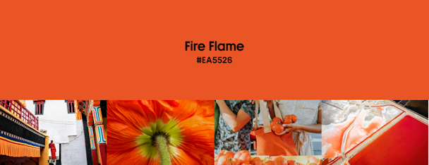
Great for: hero images, product visuals, and emotion-evoking video advertising.
Best color match: contrasting blues and greens; white, beige, and gray.
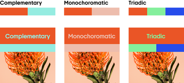
Meet a non-conventional twist on a classic summer color. Fire Flame is all about bright days on the beach, watching the sun go down, and singing with friends on warm July nights while camping together in the woods. In other words, this color is nostalgic, optimistic, and immersive - it lets us hear, smell, and touch it in our imagination.
Suppose your product or service is something clients buy emotionally to make their lives more aesthetic and joyful. In that case, we recommend you leverage Fire Frame as the primary color of your seasonal campaigns. However, your visuals matter a lot here. Captivate potential clients with images that tell stories of dream vacations or imaginary words they might like. For this purpose, analyze their profiles and use these tips on launching seasonal campaigns.
Check out this dedicated collection by Depositphotos curators for photos, vectors, and 4K videos in which recent creative trends meet Fire Frame.
4. Pearlescence (#FDDFE3)
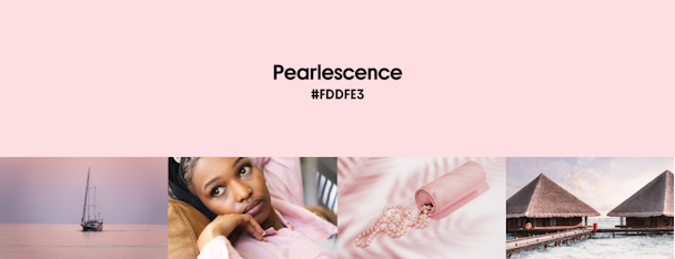
Great for: social media communication, seasonal emails, and promo banners.
Best color match: contrasting dark colors like pine green, navy blue, or burgundy.
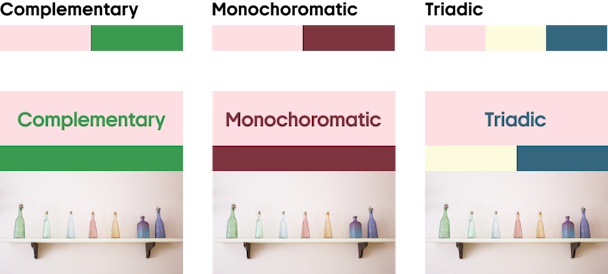
This light pink shade is optimistic, dreamy, and fresh. It can be used as a layout background or an accent color for designs with muted, dark palettes. Although Pearlescence was associated with feminine fashion in the previous decade, these days, you can also add it to content targeted at male audiences (see the personality, not gender trend that we included in our annual creative trend report).
Pearlescence is elegant and sophisticated. It can add a modern glance to traditional social media layouts and make your summer campaigns look more dynamic. If your brand operates in the beauty, wellness, or fashion industry, this hue will help you add the charm of youth to your campaigns.
Overusing pink shades can make your visuals seem childish, so if you don't want that effect, balance Pearlescence with dark colors like Summer Rain. The newest collection of visuals by Depositphotos authors provides dozens of examples.
Wrapping up: how to choose your color for summer 2024
Although each color conveys a particular atmosphere, your marketing storytelling relies on text messages, composition, and the objects you show in your communication. To find a perfect solution for your campaign, analyze what you want to achieve and try to inject each trending color individually, whether as a background color or an accent. Then, see if your layout strengthens your message or not. This extensive collection of stock images, videos, and design mockups will help you experiment with less effort.