Blandness is killing your brand – the Wolff Olins rebrand proves there is another way
A few weeks after launching Johnson and Johnson’s bland new look, Wolf Olins has revealed more bling brand for itself. Gordon Young ask if this is the beginning of the end of 'blandification.'

‘Blandification’ is a scourge ossifying the world of brand identity. CMOs want clean, safe, sensible work; something brave but safe, surprising but familiar, cut through but not stand out–something omniamazing for an omnichannel world.
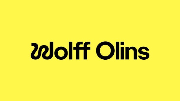
But Wolff Olins recently struck a blow against bland as it did the hardest thing any corporate branding agency can do… it rebranded itself. The aim was to create something fun, have an attitude and push the boundaries. Said one insider, “The industry has become more boring and lost its ability to challenge - the accounts are running the agencies. Where is the fun? This identity is not about winning clients. It’s about building a culture.”
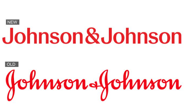
Of course, before this, Wolff Olins was in the news for another rebrand. To many, Johnston & Johnston launched a new look, which is the epitome of blandification. Out is its old mark, based on the signature of its founder, Wood Johnson and has been in use since 1887.
And in came the sort of treatment that will be well-known to lovers of airport signage. The main objective seems to reflect structural changes within the company and have a more compatible design system with the digital age.
Explore frequently asked questions
The press release said it aimed to build ‘more equity around a short-form ‘J&J’ to appear more personable, contemporary — especially in digital interfaces.”
But the only brave thing here seems to be the decision to kill one of the world’s most recognized marks to converge into the sterile sea of the pharma branding norm. You’d think the likes of Coca-Cola provide proof that heritage marks can remain relevant.
To lovers of design, this work, for the one-time talcum maker, chaffed.
As J&J abandons a hand-scribed vibe, Wolff Olins itself is embracing one.
A surreal ‘W’ in Wolf represents the creative journey. A realist ‘O’ in Olins precision thinking.
I have met some who loath this. But to me - and let’s not get too carried away - I liked it at first sight.
You instantly see how it will work across print, digital and video. You can already see it in action on the Wolff Olins website.
Advertisement
This logo lives - and encapsulates the concept of a creative journey while maintaining the brand equity of its old identity.
No doubt the agency answered the Johnson and Johnson brief perfectly. The Drum has reported on this industry for years and knows there is so much more to the corporate brand process than the logo alone.

Advertisement
But looking at the Wolff Olins rebrand, you can’t help but wonder why they could not have done something equally substantial for Johnson and Johnson.
But whatever the story there, the Wolff Olins ID is a reminder that sometimes brands should get out of the way and let designers do what they are best at. That would be the best way to beat blandification.
